


Some of the best projects start small and grow into something much bigger than anyone initially imagined. That’s exactly how our partnership with KnightFire BBQ began.
Originally a local food truck in Searcy, Arkansas, KnightFire BBQ came to Think Idea Studio with a simple request: a logo. In 2021, owner Matt Knight was preparing to make a major leap in his business, moving out of the food truck and into his first brick-and-mortar location. One thing was missing. He needed a visual identity that matched the quality, boldness, and heart behind his craft barbecue.
What started as a single design project quickly turned into a multi-year collaboration that evolved into a full-fledged brand system. Today, that system lives across logos, packaging, apparel, social media, photography, and a complete digital presence.
Unexpected. Bold. Unmistakably KnightFire.
Searcy, Arkansas, has its share of great BBQ, from chains to 40-year-old mom-and-pop spots and everything in between. KnightFire joined the ranks and quickly gained momentum as a fast-growing, highly successful local craft BBQ joint. The food spoke for itself, and so did the passion behind the business.
There’s something special about partnering with a locally grown small business that’s deeply rooted in its community. KnightFire had the perfect mix of authenticity, ambition, and local pride, making the project an easy yes for our team.
Not the Knight You Were Expecting
The initial goal for KnightFire was clear: design a logo. Just as important, however, was defining what not to do.
With a name like KnightFire, it would have been easy and expected to lean into medieval imagery or a traditional knight in armor. Instead, we wanted to push beyond the obvious and create something more meaningful, memorable, and directly tied to the product itself.
We focused on:
- The name KnightFire, rooted in owner Matt Knight’s last name
- The craft and boldness of the BBQ itself
- Avoiding cliché BBQ or knight imagery
That exploration led us to an unexpected but fitting direction.
From Chessboard to Smoke Pit: Building the Identity
The creative inspiration came from a chess knight, a symbol of strategy, strength, and intention, with a twist. Rather than a traditional chess piece, we reimagined the knight as a beef cow, tying the concept directly back to barbecue.
The identity was further grounded by:
- Local Arkansas influence
- A bold, high-contrast color palette inspired by BBQ culture
- Strong, confident shapes that felt modern yet timeless
The result was a logo suite that felt instantly recognizable, meaningful, and flexible enough to grow with the business.
Expanding Into a Complete Brand System
Once the logo was in place, everything else followed naturally.
What began as a single deliverable expanded into:
- Apparel and merchandise
- Menus and in-store materials
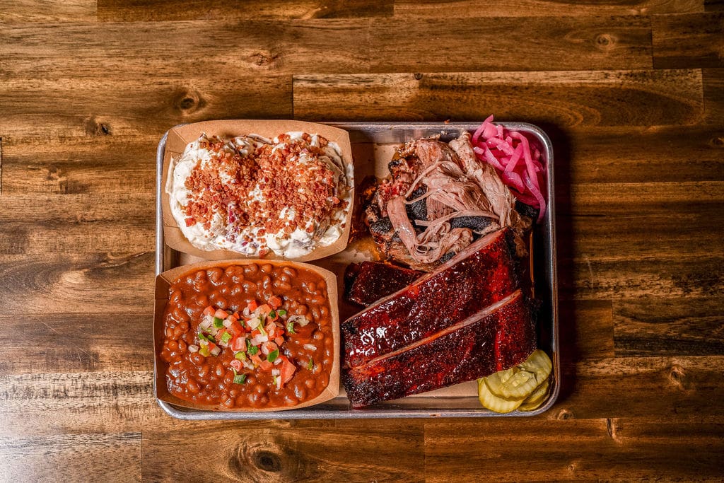
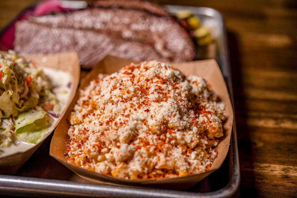
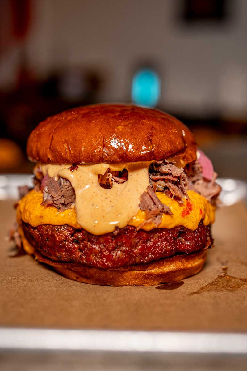
- Photography direction
- Sauce labels and stickers
- Social media management
- Website design and digital presence
Each new asset was built with the same goal: total brand immersion. Every touchpoint, from a T-shirt to an Instagram post, needed to feel cohesive, bold, and undeniably KnightFire.
Why Personalized Branding Matters for Local Businesses
National brands have the advantage of massive marketing budgets and decades of exposure. No matter where you are, you know exactly what to expect when you see Target, Chick-fil-A, or Starbucks. Their branding is baked into everyday life.
Local businesses don’t have that luxury, but they do have something just as powerful: a story worth telling.
For businesses like KnightFire, branding was not about blending in or following a formula. It was about standing out in a way that felt genuine, earned, and deeply connected to the people behind the brand. A local business deserves the same level of strategic thinking, creativity, and intention as any national name because its identity is often built one customer, one experience, and one conversation at a time.
This philosophy shapes everything we do at Think. We don’t start with trends or templates. We start by digging into the why and the how behind each client, what drives them, what makes them different, and what they want their community to feel when they walk through the door. From there, we craft brands that don’t just look good, but feel personal, authentic, and unmistakably theirs.
KnightFire is a perfect example of how thoughtful, personalized branding can help a local business carve out its own space, build recognition, and grow into something far bigger than its beginnings.
A Brand That Feels Local, Loud, and Intentional
Today, KnightFire BBQ is more than just a restaurant. It’s a brand with a clear identity and a strong visual presence that reflects the quality of what they serve.
From photography and social media to the website and physical materials, everything works together to tell one consistent story: local, craft BBQ done right.
This project is a perfect example of how Think Idea Studio approaches branding, starting with intention, building with strategy, and growing alongside our clients as their businesses evolve.
